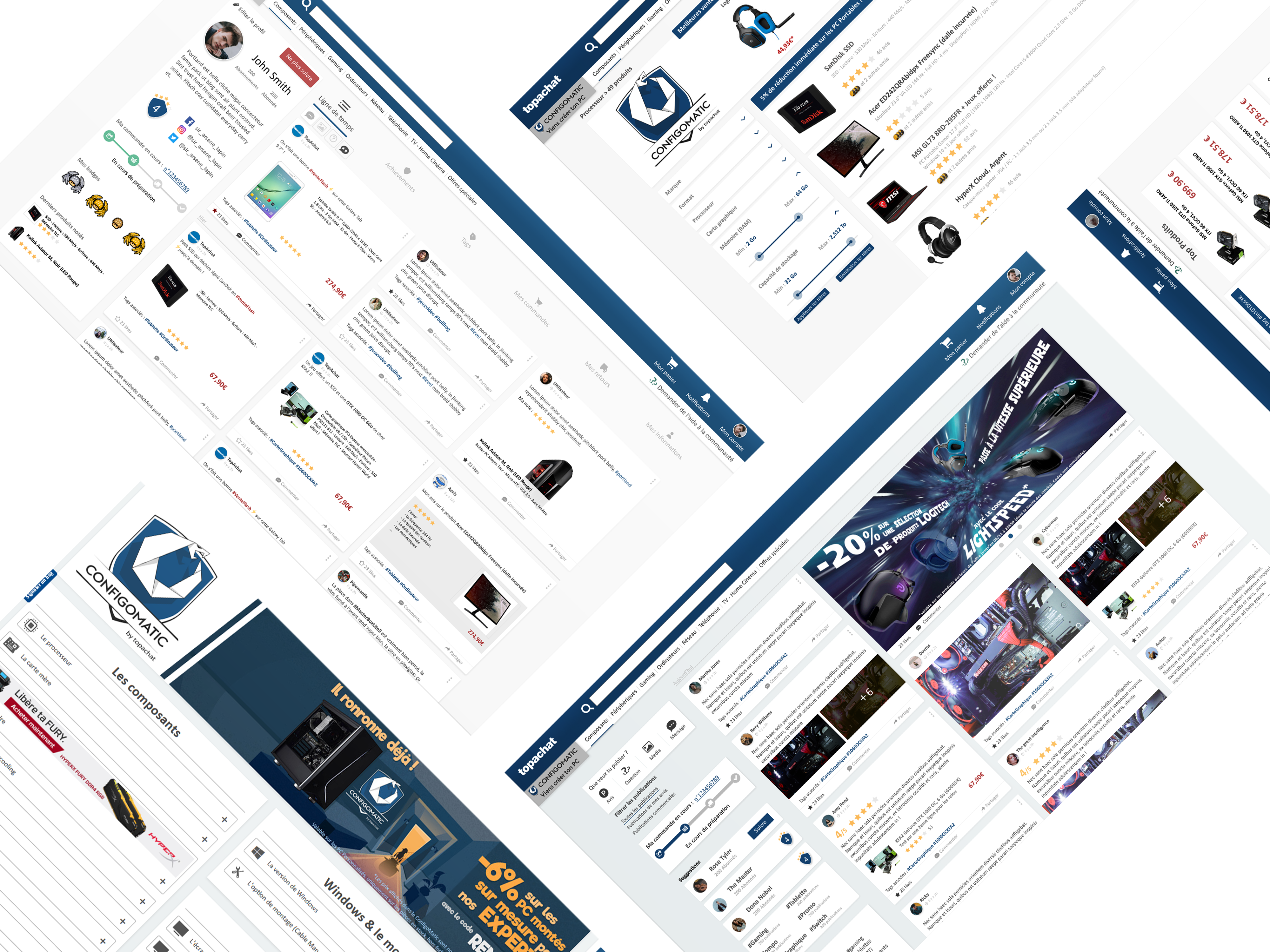
Top Achat
Case Study
Top Achat is one of the leaders in the computer selling.
Over the years, le company specialize itself in the gaming
domain and have created a strong community around its
main application: the Configomatic.
This tool is a computer configurator to help customers to
build there own computer easily.
▾

Bref
As an employee at Top Achat, I was in charge of creating the merge of a social network and an e-commerce website. I also renewed the design of the Configomatic.
This new site, which could be used as a mobile application, can create more interactions between the community, the brands and the seller throughout a social network that increased the user retention. On this app you can only talk about subjects related to a product or a brand.
The goal was to reinvent the communication in an e-commerce environment and create the first French merchant social network.
I joined the development team to improve all the design process and use the right tools to increase the collaboration. The goal was to facilitate the cohesion between the project manager, designers and developers. I had to use the existing user data to design the best experience for the community of customers.
The challenge was to work in a team of developers whom use to work without designer and without design process. I also have to create a new experience without disturbing the habit of the customers I had to add new things among the existing habits.

Target / Audience
The targets are customers who are into computer hardware and people that are used to use almost all the existing social networks.
They use them to communicate with Top Achat throughout Facebook groups and Twitter. So the target was people between 18 and 30 years old who has strong opinion for one or another brand sold on the website.

Bref
I like how those social networks highlights all the possibilities and how each app make users want to use all the functionalities to share anything they want. I really needed to work on the readability.
Each existing social network has a vertical view for posts but in a limited amount of space so we have to scroll a lot to see what we want.
I was aware that the scrolling was part of any social network experience for user retention but for me, it does not apply for a social network that is also an e-commerce website. In a desktop display the users should see as many posts as they can to find the product that they want.
We needed to find a better way to show the best products with the most interactions between customers with multiple columns of publications. The marketing department would also animate the social network and emphasis posts from Top Achat ands the brands.

Typo
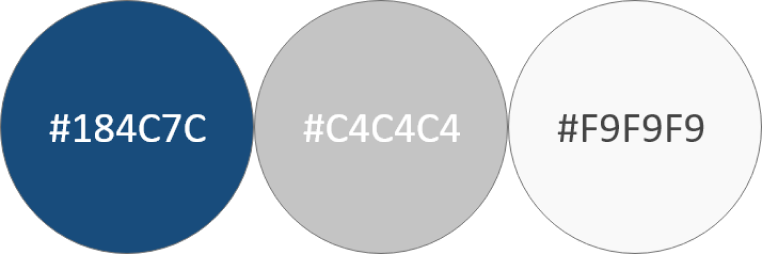
The colors had to be modernized. We switch from a light and old blue to a darker blue based on the new logo of the Configomatic.
ROBOTO
The typography is more classic to improve visibility and not distract the user with a fancy font. Another reason for a classic font is that the app should be working as a mobile app with a PWA (Progressive web application)
Wireframes
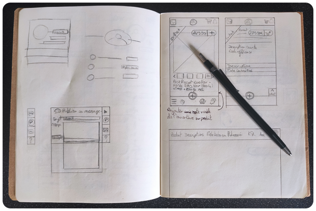
Always start with pen and paper
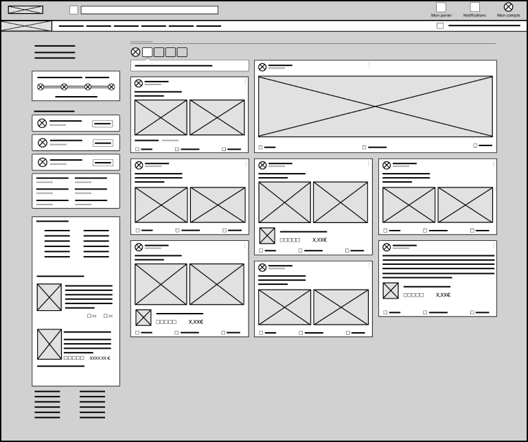
Desktop – Homepage timeline with publications and a bigger card for emphasis an important publication by Top Achat.
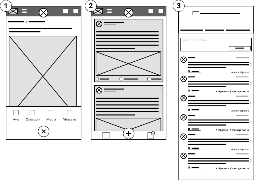
1 – One publication display and menu for choosing what the user wants to publish
2 – Timeline, list of publications.
3 – Ask questions to the community
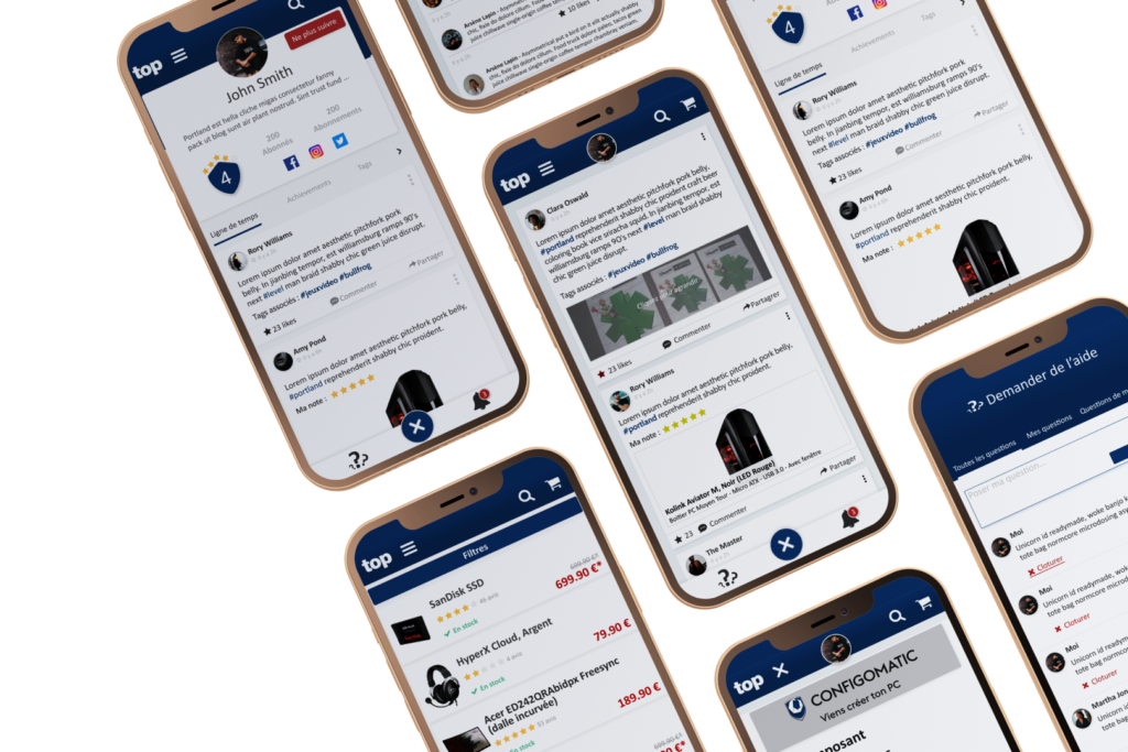
Mobile Mockup
